3 Essential Tactics to Improve B2B Landing Page Conversions
LANDING PAGE CONVERSIONS
In a previous article, I shared insights from analyzing 300+ B2B messaging user tests.
What did the article tell you?
Six questions audiences ask when they visit your home, landing, or product page. If you answer them, you’ve got a better chance of converting visitors into customers.
But based on feedback from user tests, putting your message on a page isn’t enough.
You also need to make your messaging:
In this article, you’ll discover how to achieve the above, backed up with good (and bad) examples from B2B websites.
Let’s begin!
Great B2B messaging is useless if visitors can’t find it. In my user-test experience, this is usually because the visitor:
Can’t read the message,
Is being drawn to something less important.
Here are two examples to illustrate what I mean.
1. Make messaging accessible
This is problematic for those with low contrast sensitivity or color blindness.
It can also be an issue for all your visitors under certain lighting conditions such as sunlight and glare.
Another culprit is small font size.
Small font doesn’t just impact the visually impaired.
Anyone who visits your website will have to squint, and waste precious time, to read small font.
The following font size issues often appear in user tests.
The first problem is the copy on the left-hand side 👇
It’s 14px, but should be at least 16px.
The second is the copy in the image on the right 👆
This is a UI screenshot, but visitors will still try to read the text. If UI text isn’t important, blur it so they can’t see it at all. Or let them enlarge the image to make the text legible.
Mistake #1: Text is hard to read
Mistake #2: Visitors are distracted
The second most common reason visitors don’t find your B2B messaging?
Distraction.
Here’s a hero section example.
Click ▶️ in the screenshot below. What do you see first?
Like most user testers, you’ll have been drawn to the animated image.
Except that's not the most important message here.
Here's another example. Where does your eye go first?👇
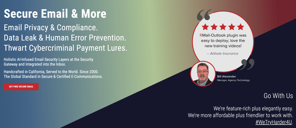

Again, you're drawn to the image and quote.
But the quote conveys a different message (ease of deployment) to the one in the value proposition on the left (privacy & security).
Don’t get me wrong.
Hero section images are useful.
They can communicate, or support, the three key messages each hero section needs to convey:
What’s your product category?
What value does your product offer?
Is your product for me?
But these two examples do none of these.
It’s the value proposition copy that does the heavy lifting 🏋️♀️.
Directing the visitor’s short window of attention away from these messages is a bad idea.
Focus the visitor’s attention on the key B2B messaging that section must convey. Question any design choices that do the opposite.
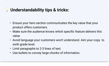
2. Make messaging understandable
Mistake #1: Vague language
Even if visitors can find your message on the page, it still needs to make sense.
Not easy.
User test reviewers often complain they can’t understand the message.
Common issues are:
The text is bland and lacks value
There are too many buzzwords
The words are too complicated
This hero section should communicate value. Instead, it's vague marketing-speak👇
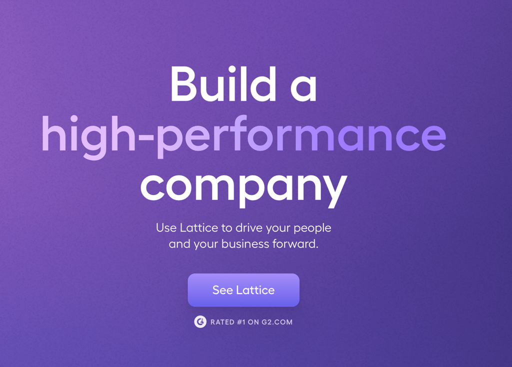
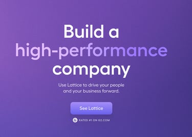
How do they build you a "high-performance company"?
What does "drive people and business forward" mean in practice? 🤷
Maybe they get into the specifics when you scroll down. But why test the audience's patience at this crucial stage?
Mistake #2: Jargon
Here's another vague hero section👇
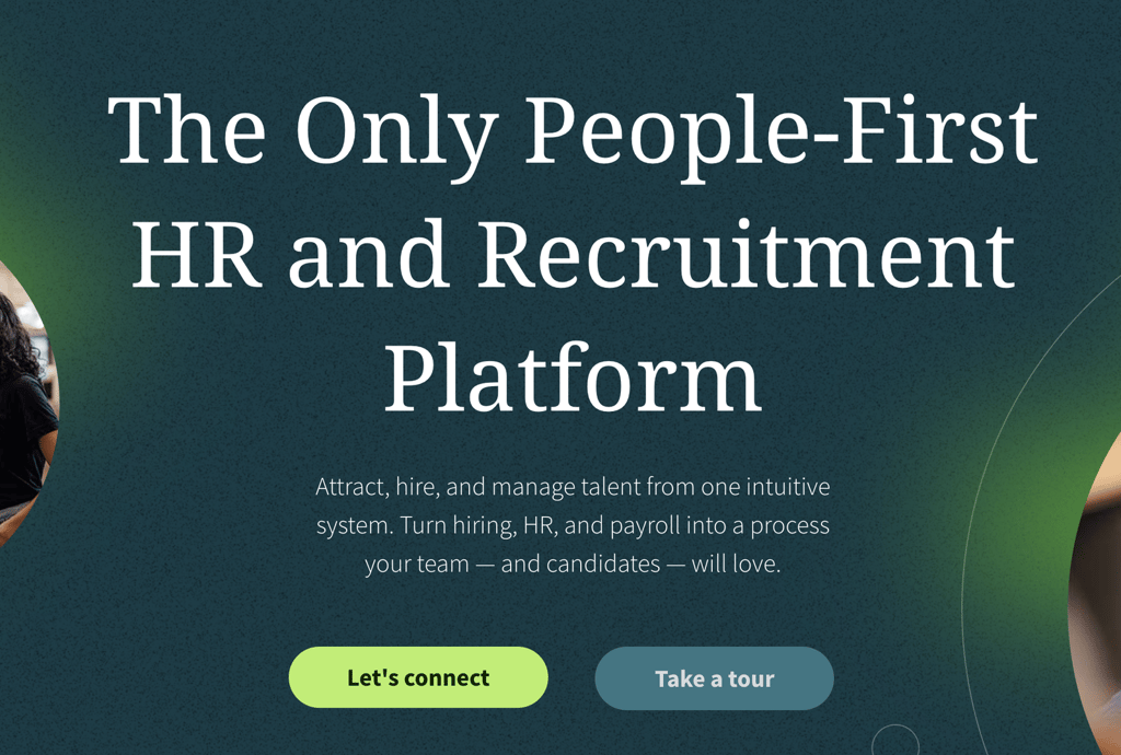
The headline (H1) and sub-headline (H2) lack specifics.
What exactly is a "People-First HR and Recruitment Platform"?
Sounds like buzzwords.
How do they "turn hiring, HR, and payroll into a process your team and candidates will love"?
Maybe it's because they have "one intuitive system"?
But they could be more specific.
Quick idea: replace it with the one feature customers couldn't do without. The one that gets them to renew their subscription.
Mistake #3: Brain overload


And no, the designer didn't forget to remove the placeholder text.
They translated the Latin motto in the sub-headline. I wonder if their audience knows that?
Mistake #4: Too much text
In user tests, this amount of copy always draws negative comments.
People just don’t have time to read it. Especially not in hero sections, when you have seconds to engage them.
Tip #1: Make every word count
This hero section is nice and clear 👇

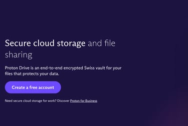
It succinctly communicates their:
Category (cloud storage and file sharing)
Value (security)
How the value is delivered (encryption)
Tip #2: Use design to clarify meaning
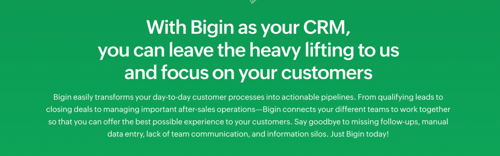
This features section has lots of copy. The design makes it easier to read, but there's a problem. Can you spot it?👇

The problem?
Color contrast. Especially in the copy below the headline.
3. Make messaging credible
Mistake #1: Failure to back-up claims
If visitors can find and understand your messages, there's one last hurdle to overcome before you're home and dry.
Skepticism.
Consumers are naturally skeptical when companies talk about their product.
Natural, because companies aren't impartial commentators. They have skin in the game.
What does this mean for your B2B messaging?
It means audiences doubt:
the value you say your product delivers
how you claim it delivers that value
anything you say to counter objections to using your product
Social proof is a tried and tested way to combat skepticism. It comes in various forms, but can be counter productive if you get it wrong.
Here are some examples of good (and bad) social proof.
Here’s a hero section that makes a bold claim 👇
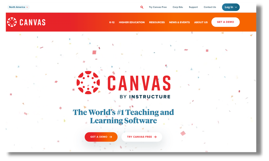
The problem?
That’s the first and last time they mention the claim to be the "World's #1 Teaching and Learning Software".
Who awarded it?
When?
What does the award mean?
They don't say, so the audience has no clue if this is accurate or not 🤔.
In user tests, unsubstantiated claims lead visitors to doubt every other claim on the website.
If it’s genuine, provide a source.
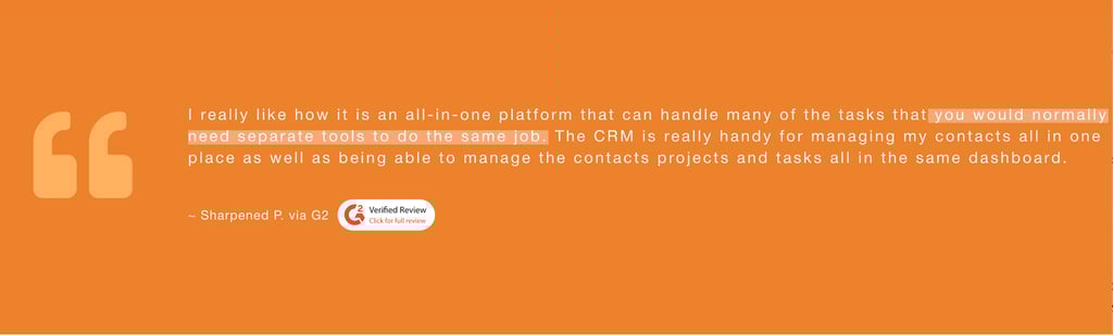
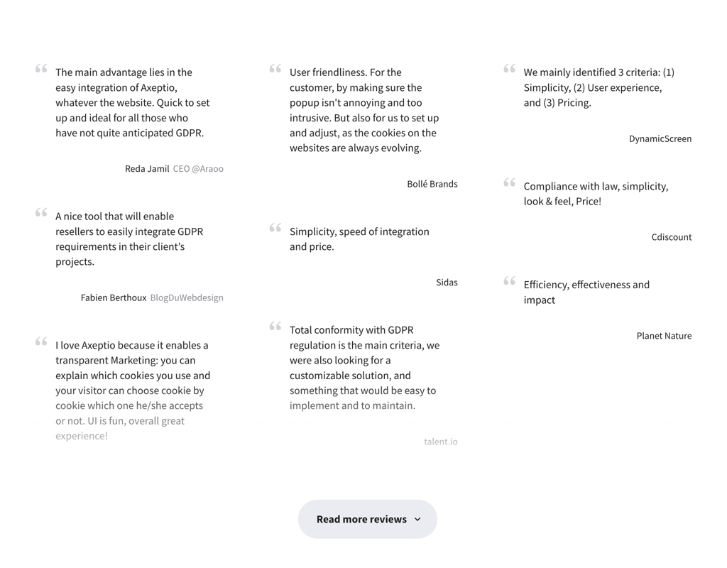
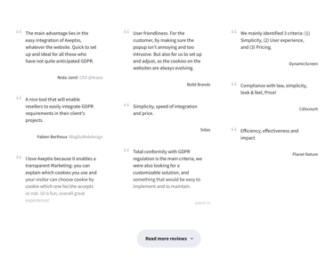
Mistake #2: Incomplete testimonials
Here are testimonials with credibility issues👇
Tip #1: Use genuine numbers backed by sources
This is a good example of claims backed up with credible proof 👇
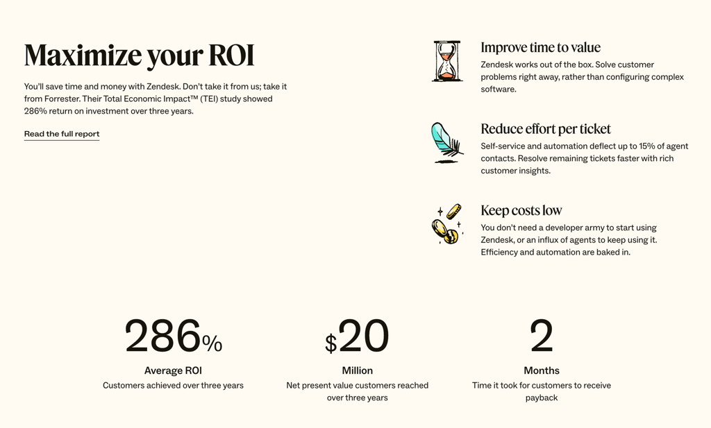
There are two reasons this works:
The 286% looks genuine
The numbers are from a credible source (see the copy below each statistic).Why don't the $20M and 2 month claims look genuine?
Because they've been rounded up. Tampering with numbers makes them less credible.
It's always better to give the actual performance figures, no matter how uneven they look.
Tip #2: Use a well-placed testimonial
This testimonial is OK, but could still be improved👇
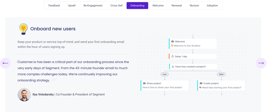
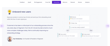
What's good?
It has a photo and company name.
It’s near the claim it’s supposed to back up ("onboarding is easy")
They could make it easier to find by providing more contrast between the quote and the features copy it supports.
How does your messaging compare?
If you follow this article's advice, your visitors will be able to find, understand, and believe your B2B messaging.
Do you know if your website follows this advice?
If you're not sure, you've got two options.
Use this checklist to find out. It contains all six questions from my previous post, and the tips and tricks included in this article.
Hire me to do that for you. I prefer to chat with people before we work together, so schedule a call here.
Let me know how you get on, or ask a question, in the comments below. Feel free to connect with me on LinkedIn too.
Good luck! 💥
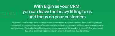
Being vague isn’t the only reason visitors won't understand your B2B messaging.
So is using language that forces your audience to think too hard.
Like this 👇
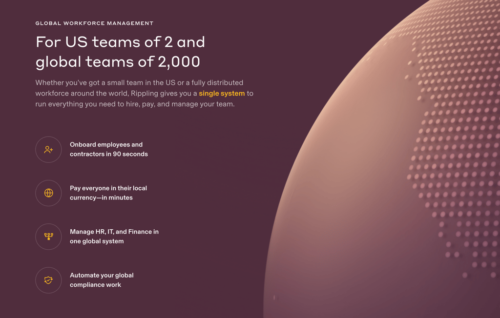
Having too much text can also make your messaging hard to understand.
Like in this sub-headline 👇